


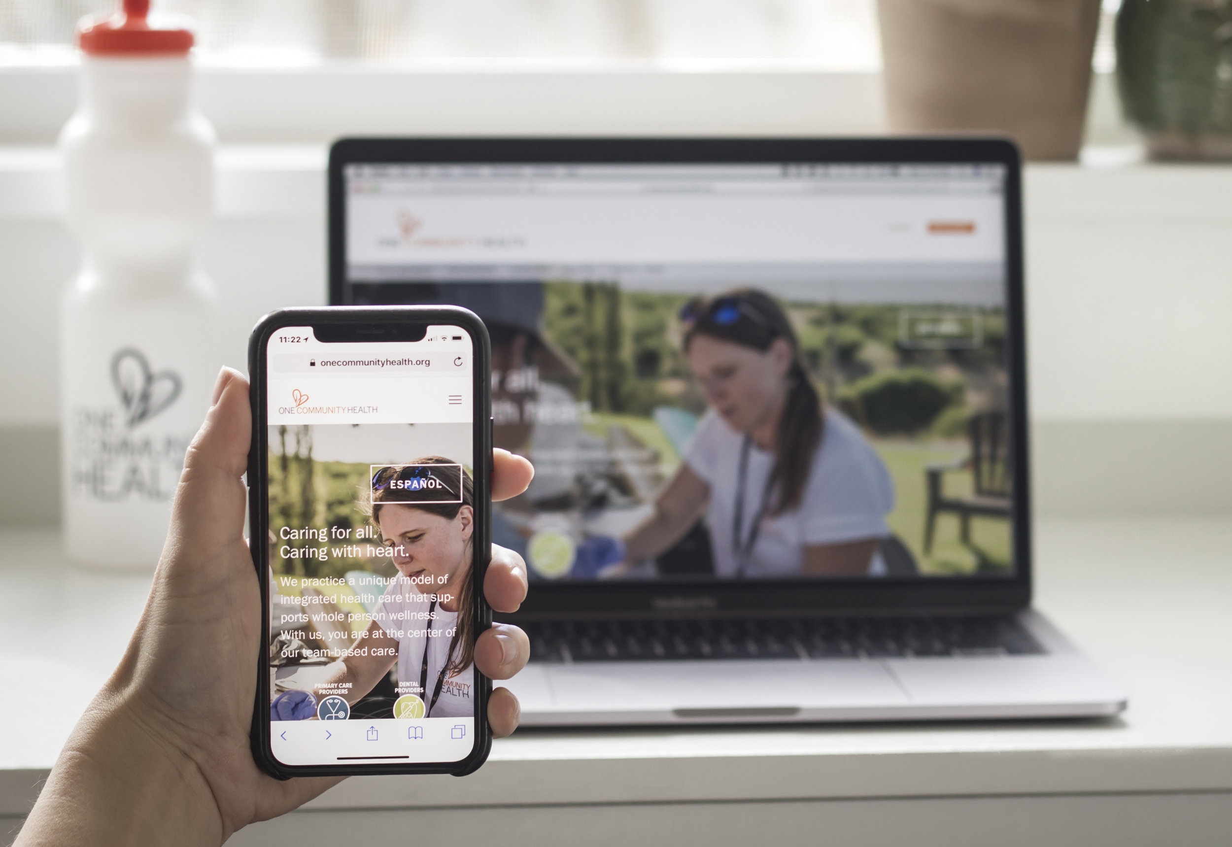
One Community Health
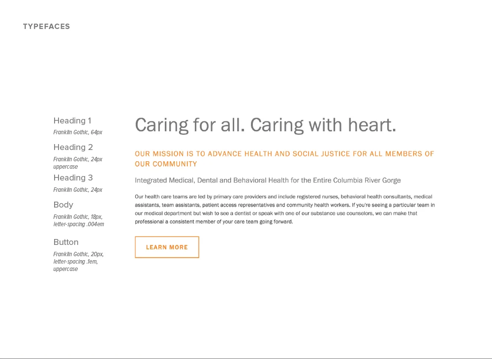
Caring for all, caring with heart
CHALLENGE
One Community Health reached out to Blue Marble in late 2016 for help with a new website. This federally funded community health center serves all people, regardless of their ability to pay. The health center was urgently in need of a more effective presence online. Their website had been neglected for years and was becoming an obstacle to sharing information.
Upon meeting with the leadership of One Community Health, it became clear that affordability of services was just one of the many remarkable aspects of their offerings. Blue Marble was challenged with the task to convey that affordability and inclusiveness in no way translates to a sacrifice in quality. In fact, One Community Health’s unique whole-person approach is cutting-edge.
INSIGHT
The leadership team's goals included:
greater visibility for their integrated approach to care
emphasizing a brand new element of care—Behavioral Health
Spanish and English language versions of the website without an excessive maintenance burden on staff
Accessibility to mobile devices
A structure for ongoing publication of health resources and other articles
RESULTS
Thoughtful information architecture made sense of the offerings and provided scaffolding for an extensive re-write of the content in collaboration with Katie Roberts.
A user-friendly content management system (CMS), has allowed the site to grow and change, thus making updates possible for OCH in-house and non-technical staff members.
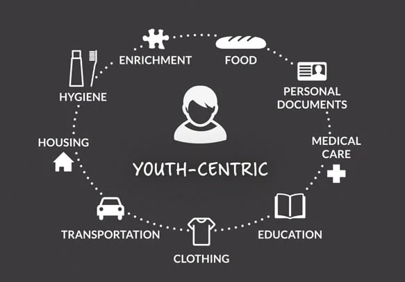
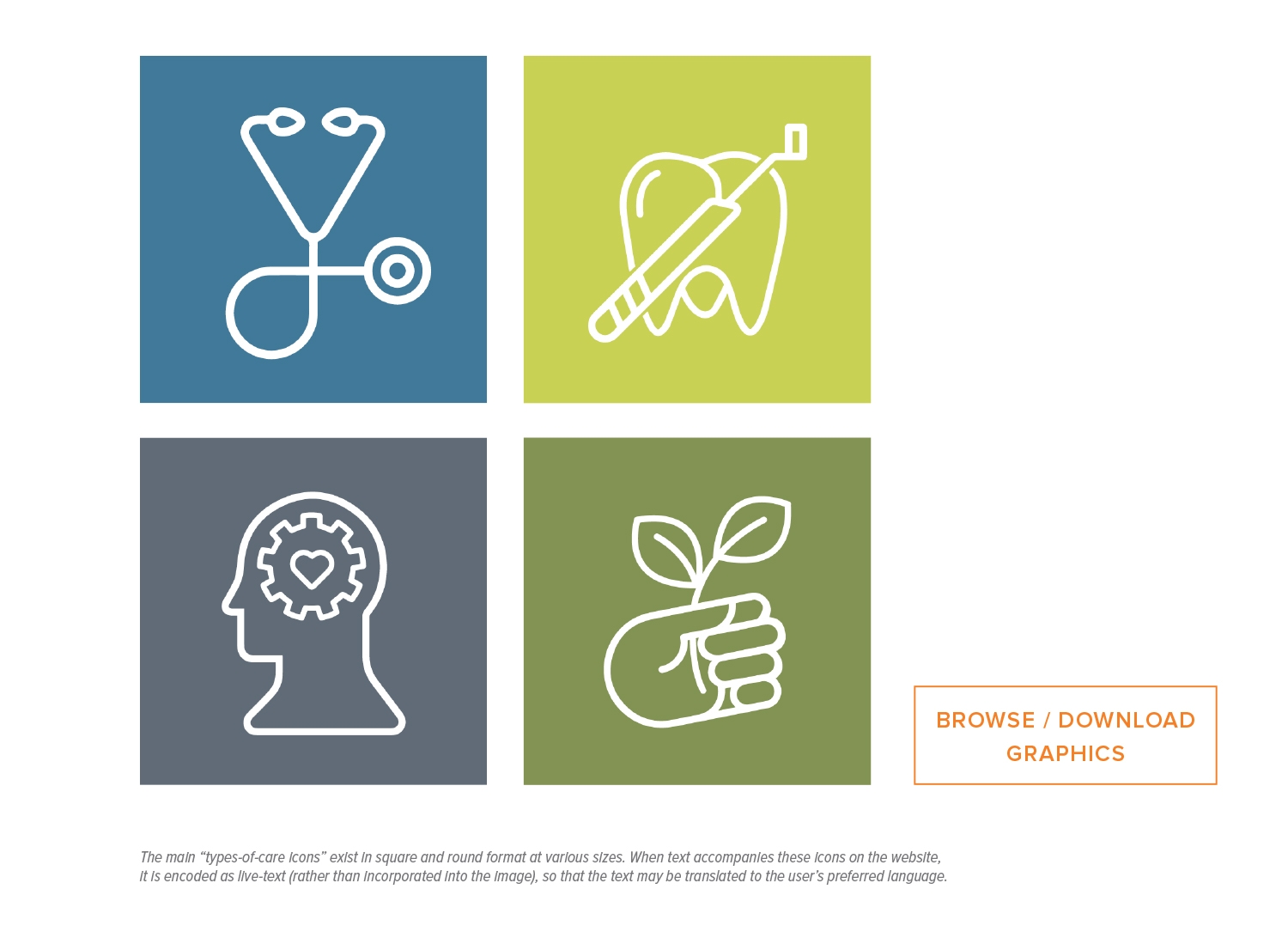
The graphics and icons we developed convey the idea of whole-person health and its various components. These provide consistency across all media.
We coordinated and directed three days of on-site photography to produce a library of authentic, professional photos to reinforce key messages.
We created a brand guide and a detailed website handbook along with ongoing training and technical support, empowering OCH to bring website and brand management in-house.


(photo credits Jen Jones)
CLIENT
SERVICES
Brand and message development
Website design and development
Training and ongoing support