
A unique solution to youth homelessness
CHALLENGE
Maslow Project has worked hard to establish a network of programs and support to address the physical, mental, emotional and aspirational needs of Jackson County’s homeless youth and their families. When they contacted Blue Marble, Maslow already had tremendous impact in the community and was highly regarded as an agency of integrity in advocating for its clients. Although Maslow Project had already gained some national (and even international) attention for its innovative model, they struggled to allocate the necessary resources to build and maintain a cohesive brand identity. Unfortunately, this led to confusion with other human services organizations in the community. When a donor asked where Maslow needed the most support, the leadership spoke up about the need for help with branding. The donor suggested (and generously funded) Blue Marble to develop a communication strategy to take Maslow's communications to the next level.
INSIGHTS
We took a two-pronged approach, developing one communication piece aimed at homeless youth and families, and another aimed at donors. The two audiences are both critically important, and in the process of developing these different items we gained a lot of clarity about the different needs and perspectives of each.
Maslow’s clients are young people, so protecting their privacy and respecting their dignity is paramount. As such Maslow had long ago decided against using images of their clients’ faces or other identifying features in any marketing or outreach material. We wholeheartedly agreed and took this into account when considering concepts for imagery. We all agreed that Maslow’s successful art therapy program would be a wonderful resource for inspiration.
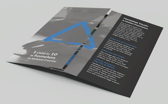
The blue triangle in the Maslow logo is a powerful symbol that we retained and emphasized. The meaning of the triangle conveys many things besides the literal reference to Abraham Maslow’s hierarchy of needs. We were reminded of the gable of a roof, a tent, raising up, strength, and stability. Inspired by a client artwork that depicted hands together in the shape of a triangle, we recommended that the Maslow team start using this hand gesture in real life as a physical symbol denoting “Maslow." When the hands are together formed into the triangle, they also convey the idea of embracing, encircling—Maslow’s wrap-around support.
It was also important to keep in mind that homelessness often goes unnoticed because it's not what people may assume. We were careful not to use any imagery that depicted dirty, downtrodden persons hanging on street corners or in back alleys. By contrast, we show uplifting images based on what Maslow offers its clients and their families and portray the outcomes that Maslow kids experience.
RESULTS
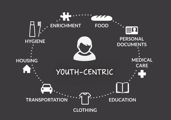
Now Maslow has a consistent, tangible way to describe how it works and to reference the many services it encompasses. External communications are better aligned with the organization’s internal vision.
Maslow is able to differentiate from other organizations and establish its unique value proposition.
Staff report a greater confidence and clarity when talking to others about what Maslow does.
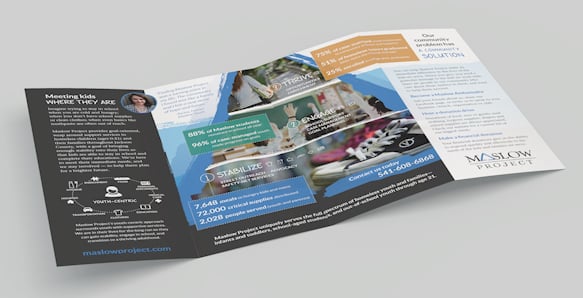
The team now has key collateral pieces like brochures and an array of visual assets, and they have been able to use to create other material in-house.


Photography credit: Natalie Faye (hands images and many others used on brochures)
CLIENT
Maslow Project
SERVICES
Communication strategy
Brand and message development
Print and digital publication
FOCUS
“It’s been capacity building for us in terms of now we not only have the assets, but we have the different pieces. We have our message much more finely targeted, and that did exactly what I was hoping which was to enable us to be more effective in telling our story out in the community and get community engagement.”
– Karen Phillips, Development Manager
“We are very happy with the products that we have. We have used them and people are responding very favorably. Our donors who funded the project are extremely pleased with the end result.”
– Mary Ferrell, Executive Director