


Blue Marble has been a key partner throughout the development of the product/Ux and brand communications for both EdReady and its parent organization (NROC) going back over 12 years…learn more.
Blue Marble has been a key partner throughout the development of the product/Ux and brand communications for both EdReady and its parent organization (NROC) going back over 12 years…learn more.
From launching a new brand and website in March of 2020 through the first few years of growth with many different projects, initiatives, and events, we’ve provided creative/technical services and guidance…learn more.

SOQ (brochure) cover

Proposal interior spread with stylized process graphics
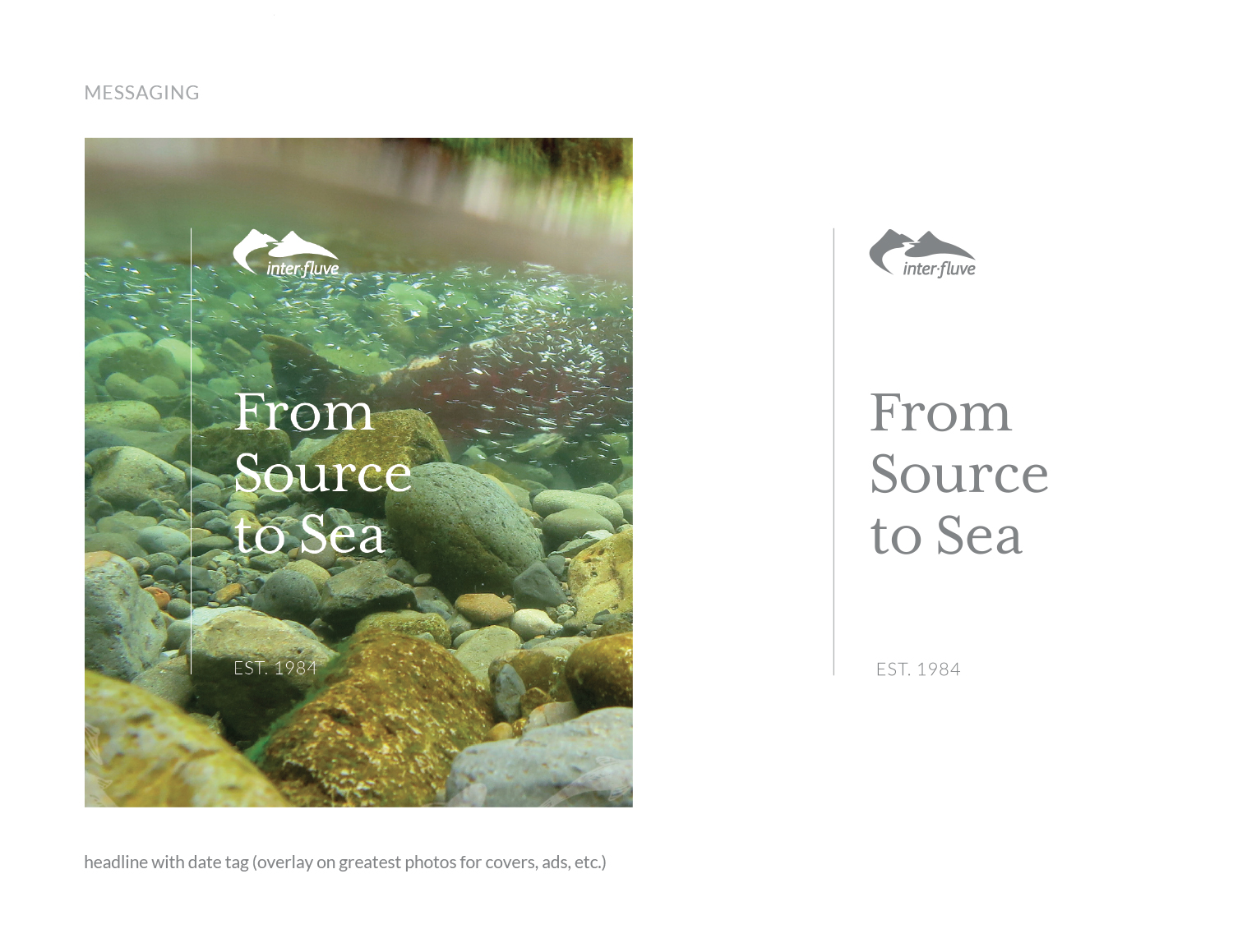
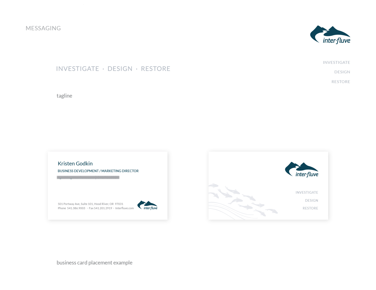
Inter-Fluve is an interdisciplinary firm specializing in investigations, design, and restoration of rivers, lakes, and wetlands. As pioneers in their field, they develop solutions to complex aquatic challenges while balancing human and environmental needs. With over 1,600 successful projects across 4 continents and all regions of the United States, Inter-Fluve is challenged to communicate the depth and breadth of their excellent work.
The firm had worked with Blue Marble in 2013 on a variety of printed materials. Inter-Fluve used the guidance and design tools we provided for five years, then engaged our services again in 2019. The above images show a few examples from an extensive body of work, including InDesign templates for long proposals and the company’s Statement of Qualifications.
Inter-Fluve marketing staff have a variety of new tools and skills at their disposal. The firm looks forward to strong growth while also staying true to their roots.
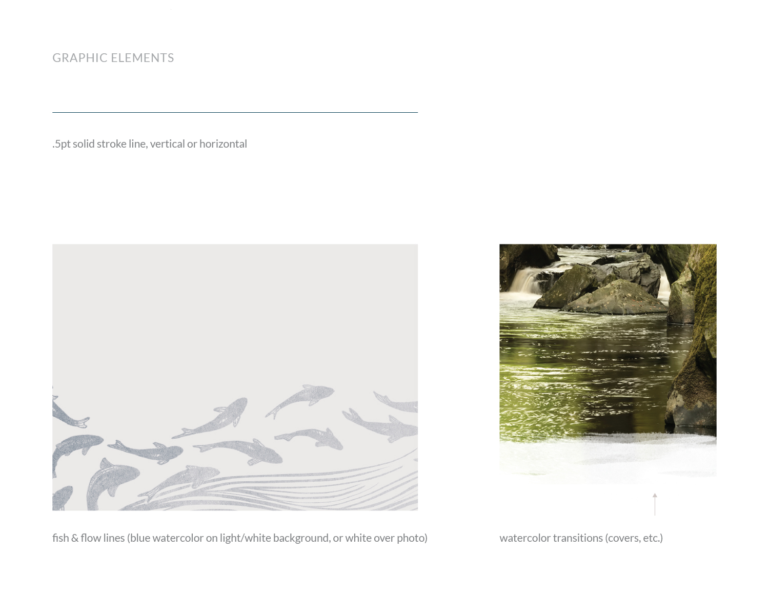
Original fish and milestones vector illustrations by Maisie Richards of Inter-Fluve (reconfigured and stylized by Blue Marble)
“Clients and employees have been impressed with our materials. BMC did a great job in completing what we asked of you. The templates are elegant yet simple; they make the company look good. Just as important, I think they make employees feel proud of the product they are creating.
– Jonathan Graca, Marketing and Field Technician, Inter-Fluve
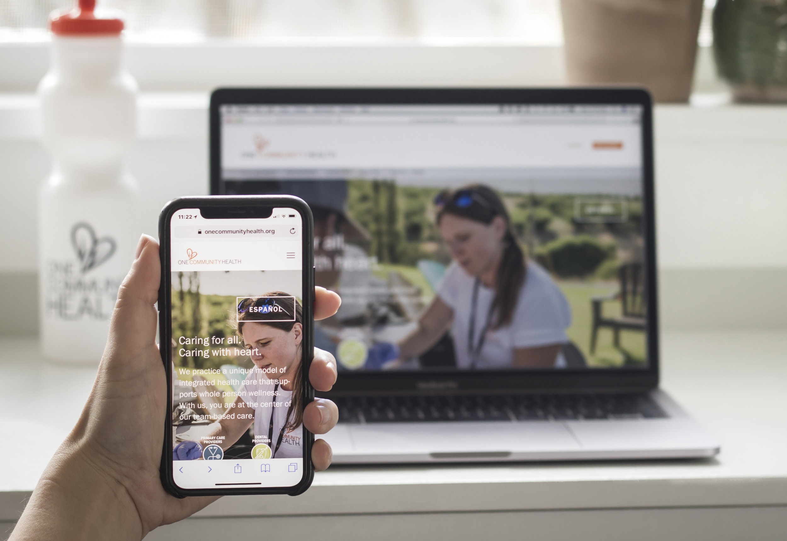
One Community Health reached out to Blue Marble in late 2016 for help with a new website. This federally funded community health center serves all people, regardless of their ability to pay. The health center was urgently in need of a more effective presence online. Their website had been neglected for years and was becoming an obstacle to sharing information.
Upon meeting with the leadership of One Community Health, it became clear that affordability of services was just one of the many remarkable aspects of their offerings. Blue Marble was challenged with the task to convey that affordability and inclusiveness in no way translates to a sacrifice in quality. In fact, One Community Health’s unique whole-person approach is cutting-edge.
The leadership team's goals included:
greater visibility for their integrated approach to care
emphasizing a brand new element of care—Behavioral Health
Spanish and English language versions of the website without an excessive maintenance burden on staff
Accessibility to mobile devices
A structure for ongoing publication of health resources and other articles
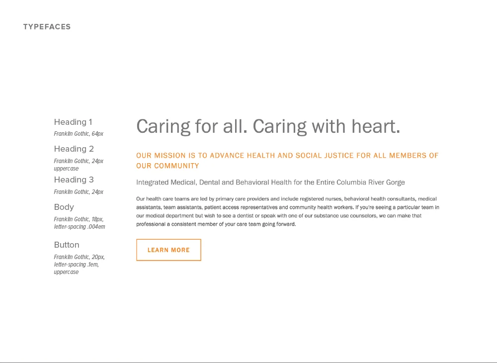
Thoughtful information architecture made sense of the offerings and provided scaffolding for an extensive re-write of the content in collaboration with Katie Roberts.
A user-friendly content management system (CMS), has allowed the site to grow and change, thus making updates possible for OCH in-house and non-technical staff members.
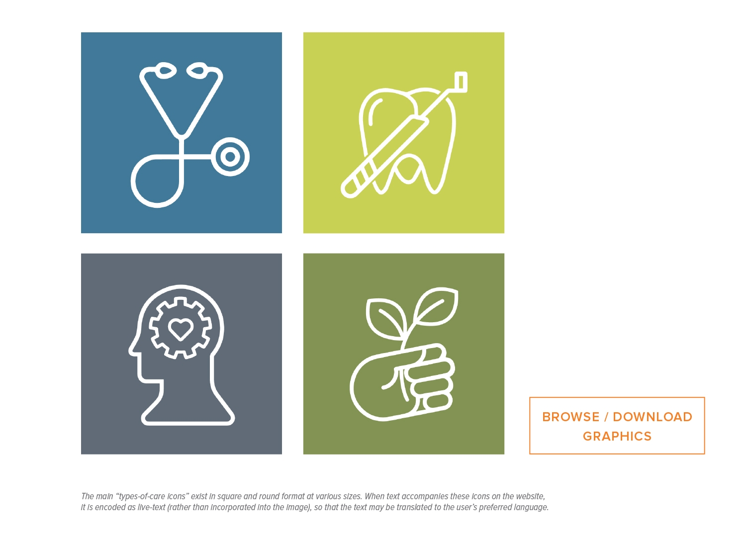
The graphics and icons we developed convey the idea of whole-person health and its various components. These provide consistency across all media.
We coordinated and directed three days of on-site photography to produce a library of authentic, professional photos to reinforce key messages.
We created a brand guide and a detailed website handbook along with ongoing training and technical support, empowering OCH to bring website and brand management in-house.
The concept we suggested for an all-staff heart photo was completed in less than 20-minutes due to our careful planning beforehand, saving valuable time and staff resources. We accomplished this by scouting the site in advance multiple times, securing a cherry-picker, and developing a 3d model based on the anticipated number of people, then measuring and staking out the locations for the people to be guided to stand in an orderly, timely way.
Scott Edwards Architecture
(photo credits Jen Jones)
Brand and message development
Website design and development
Training and ongoing support
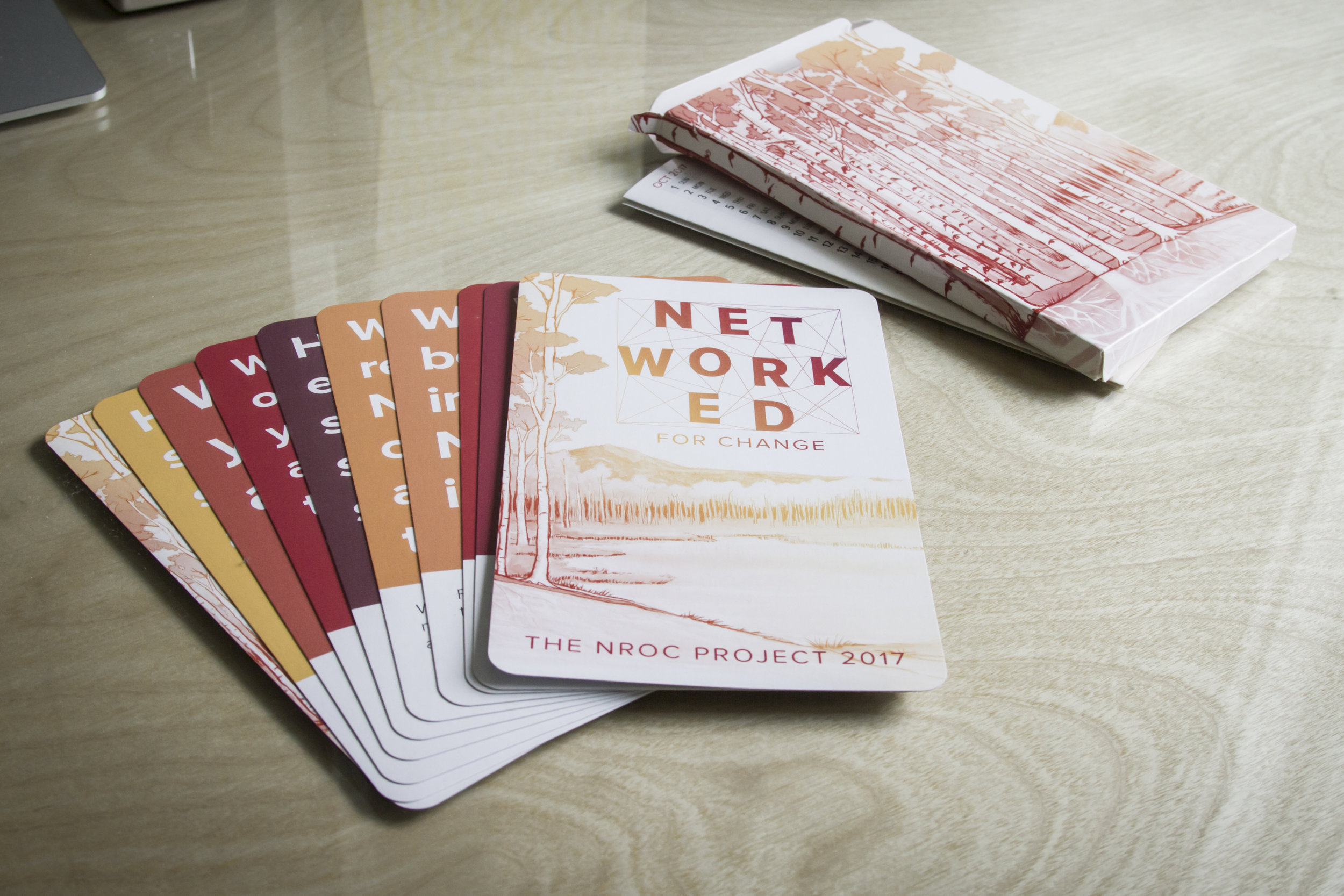
In 2016, NROC's marketing leadership identified "Networked for Change" as the theme of their upcoming 2017 annual member meeting. Blue Marble was tasked with developing a visual identity for the theme.
The team at NROC felt inspired by aspen trees and wanted to use an aspen forest as a metaphor to describe how being "networked" is a powerful force for change. We agreed that the idea was a great fit for this collaborative group of education leaders. The branding program would need to appeal both to young teachers and seasoned administrative leaders.
"Networked for Change emphasizes how natural and human systems of connection encourage resilience and evolution. The NROC Network of members is a powerful force for change, unified by a commitment to honor and support all learners."
—Amanda Melton, NROC Marketing Director
For the campaign visuals, we created an illustration of an aspen forest spreading across a landscape with connected roots underground. In addition to creating the illustration, we developed the overall visual identity, including the Networked for Change logo and a style guide with defined colors, fonts, and graphic elements. Working closely with the NROC marketing team, the theme was integrated into conference activities. The visual identity was applied across a range of media, including signage, name tags, agenda, tote bags, notebooks, a card deck, slide presentations, websites, emails, conference app, and more.
The Networked for Change branding succeeded in capturing the mood of this nonprofit project as its membership works behind-the-scenes to re-think pathways to student success and improve outcomes within the U.S. education system.
2017 Ambassador award winner and California Adult Education professional, Penny Pearson proudly displays her award featuring the Networked for Change aspen illustration.
(click images below to view as slideshow, scroll down for video case study)
Creative Direction: Christine Fisher (BMC) / Amanda Melton (NROC)
Art Direction, Design, and Illustration: Christine Fisher, Blue Marble Creative
Photography: Jennifer Jones || Videography: Wiley Watson
Aspen concept: Terri Rowenhorst / Ilse Wolf || Video direction / project assist: Suzanne Wright Baumhaukl
The NROC Project
Brand and message development
Print and digital publication
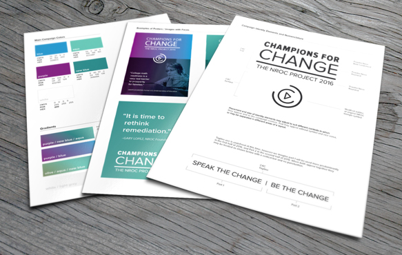
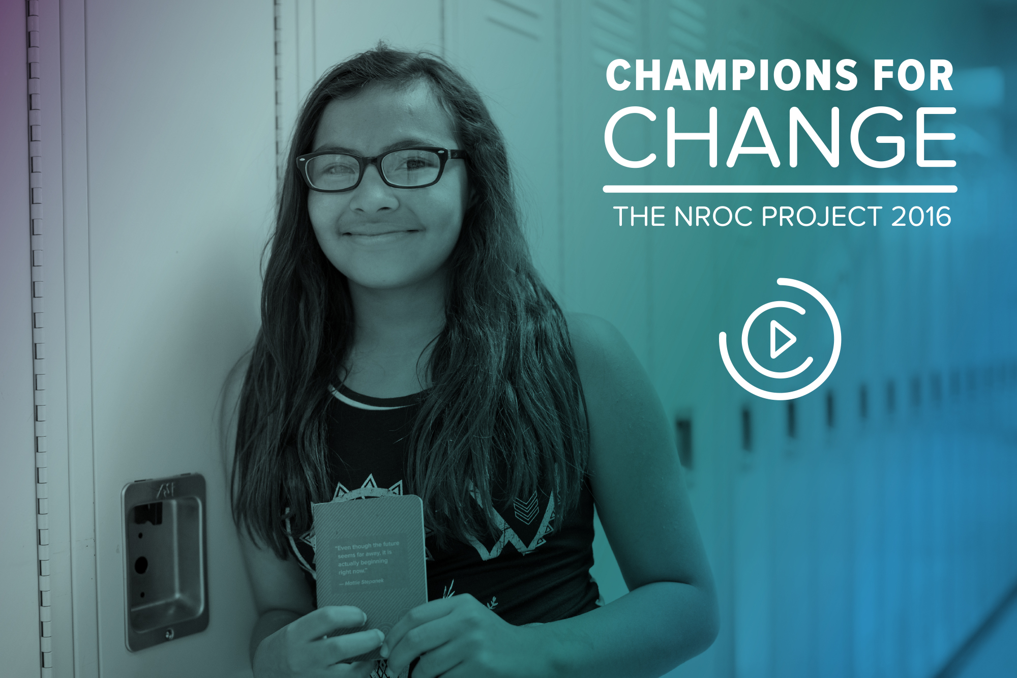
As a long-time advisor to the NROC marketing team, we join in annual strategic planning sessions to outline strategies, and tactics for the coming year. In late 2015, while developing the 2016 marketing plan, NROC's marketing leadership identified a theme of "Champions for Change." Blue Marble was tasked with developing a graphic identity for the theme. The graphics were used for NROC-hosted meetings, events, and other promotions throughout the year. Blue Marble also assisted with planning by documenting the strategy in an organized, visual format. The slide deck and summary sheet we designed helped NROC marketing staff to relate their vision easily to managers across the organization.
As a short-term campaign, Champions for Change (C4C) graphic identity would work with and play off of the organization’s overall brand identity. NROC represents a forward-thinking, innovative group of technologists and educators. It's important to keep pace with trends and present a feeling of being in-touch with the future. Our goal with the annual themes is to strike a balance—staying clearly aligned with the NROC organization's main brand while also putting forth something fresh and inspiring.
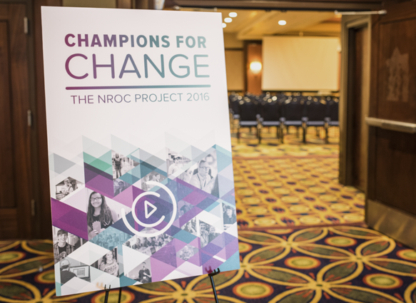
The graphic identity we created for the Champions for Change campaign makes reference to the NROC organizational logo, which includes a triangle shape inside the letter O (symbolizing a play button and forward movement). The new variation on this symbol emphasizes the outlines of the circular O shape with breaks in the line so that it also reads as two Cs (for Champions for Change). Design decisions were summarized in a simple style guide and then applied to a variety of posters, name tags, flyers, and other swag to be used at events throughout the year. The graphics have been well-received by audiences, setting the tone for an energetic and aspirational 2016.
style guide for 2016 Champions for Change theme (an internal document)

meeting participants (showing name tags, buttons, posters in background)

NROC staff and ambassadors wore buttons to represent the main products NROC has created.
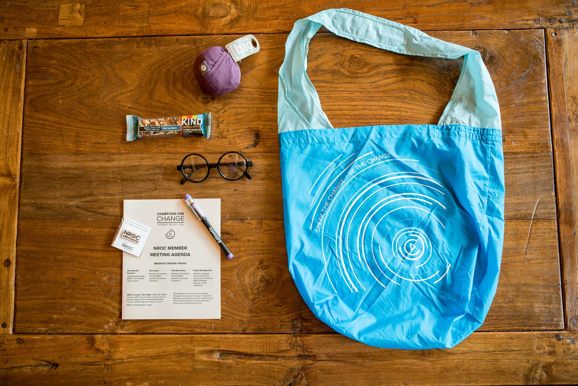
Blue Marble designed artwork for tote bags and various other items, including a simple black and white meeting agenda.
Posters featuring the C4C theme artwork guide participants to the correct rooms.

Flyers with inspirational quotes reinforce the theme and encourage reflection.


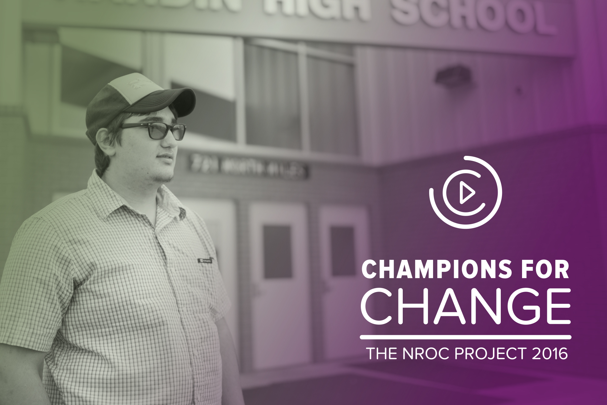
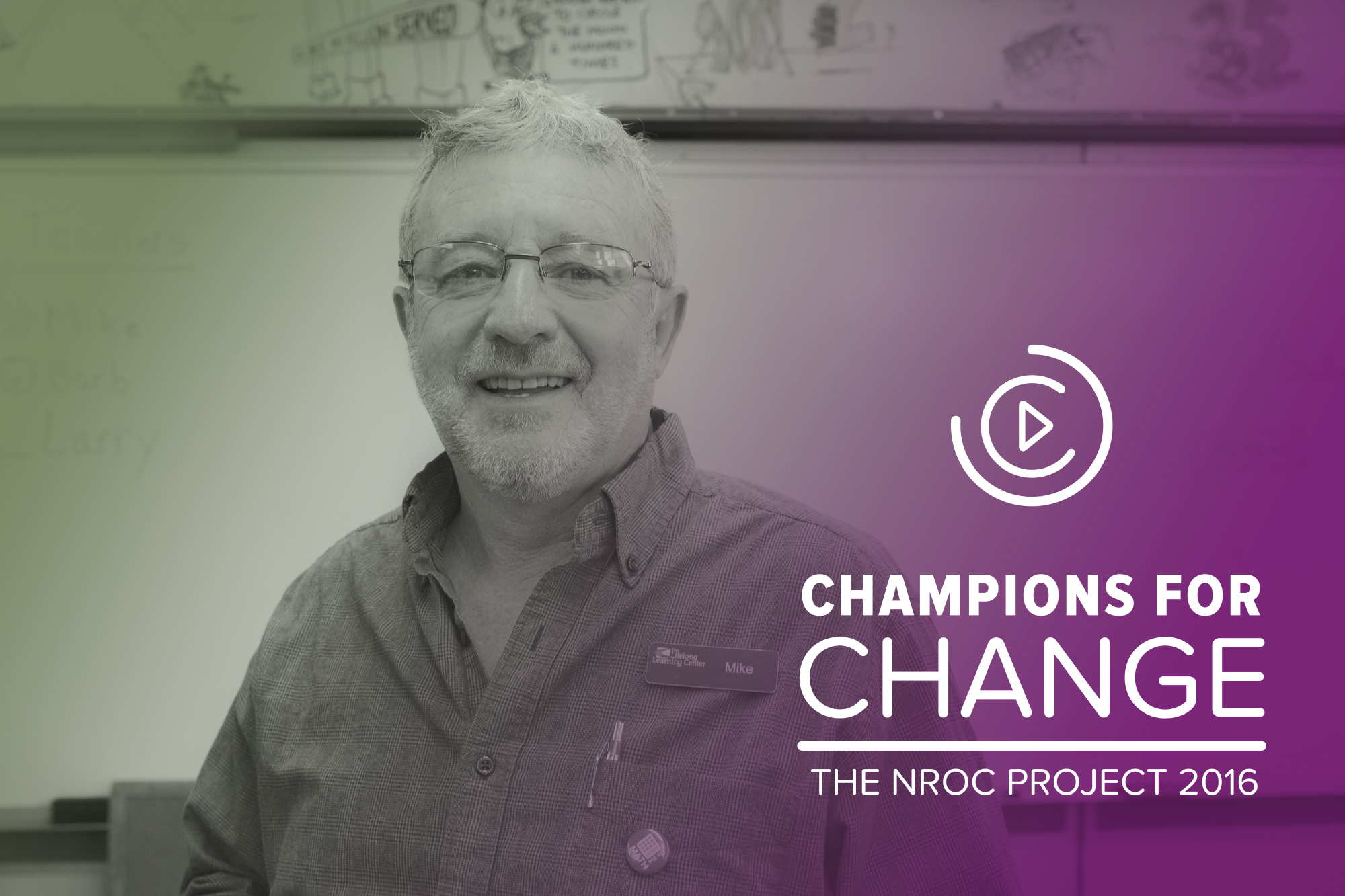
Faces of real NROC leaders, learners, and teachers were featured on campaign posters.

NROC staff hand out name tags, drink tickets, and registration packets.

A conference app was branded with theme artwork

NROC staff pose with EdReady glasses and a themed backdrop
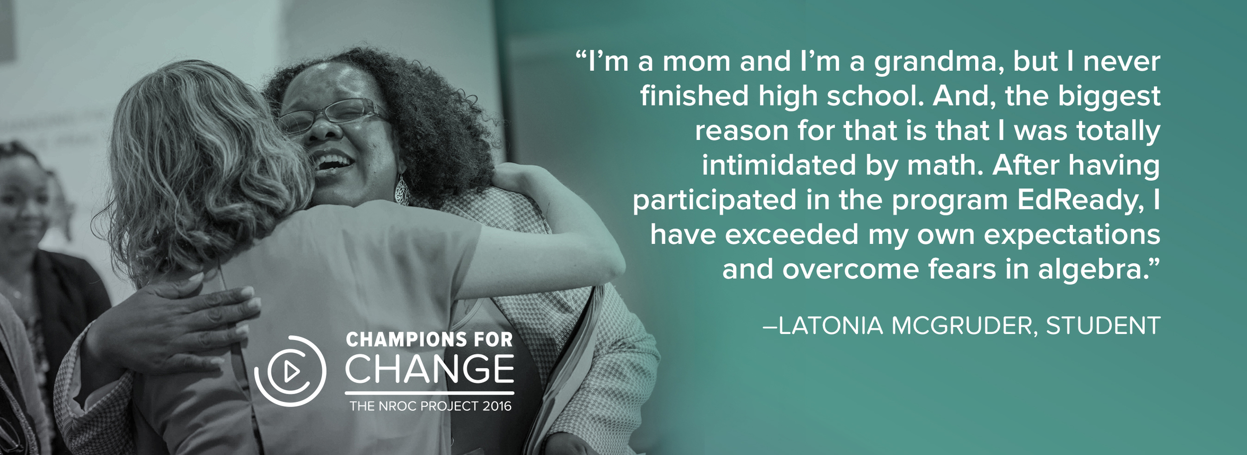
NROC is an organization that genuinely makes a difference in the lives of students and education professionals. Latonia (pictured above) went on to attend Solano Community College in California majoring in Political Science with plans to attend law school.
photos by Jen Jones
The NROC Project
Brand and message development
Print and digital publication
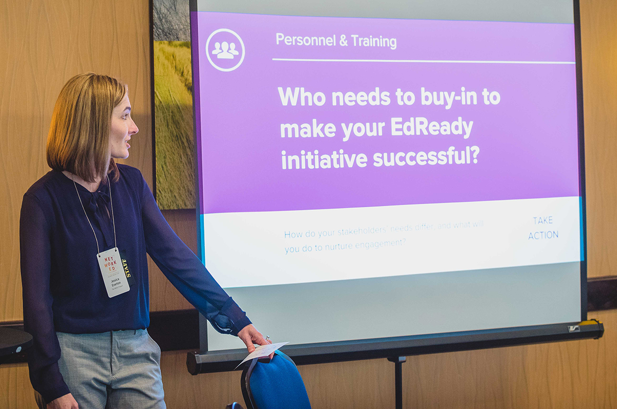
When NROC's founder, Gary Lopez, first told us about his vision for EdReady in 2012, NROC had recently secured funding from the Bill & Melinda Gates Foundation to build EdReady. The big goal for EdReady was to help vastly more Americans complete college. EdReady would be a free online tool with a more advanced and customized version used in educational institutions nationwide. The app would allow students to self-assess for math and English readiness and then follow a personalized study path to fill in their knowledge gaps.
EdReady needed to appeal to a broad spectrum of people. Imagine a student headed to a rigorous college STEM program, or an adult with math anxiety striving to earn a G.E.D. A project like this requires the involvement of many stakeholders. Blue Marble was engaged to handle design for EdReady, both UX design and the brand identity and marketing materials.

Christine Fisher and John Watson of Evergreen Education Group discuss EdReady with high school students during a day of user testing.
NROC is unique in that their work is guided by a national network of educational institutions. Therefore, the need to get buy-in from students, schools, and other education leaders is embedded into its business model.
Blue Marble helped with focus groups to test our assumptions and gain valuable insight into the user’s experience with early prototypes. Within the first three months, the interface underwent three major revisions based on feedback from students and teachers. We observed a wide spectrum of attitudes about math and college, learning our target audience's own language so we could gain their trust and engagement.
EdReady is currently being used by institutions across the U.S. including some entire state systems such as Montana, Hawaii, Utah, Idaho, Nebraska, Tennessee, North Carolina, and others.
A short documentary (about Montana) is available to show what a statewide implementation of EdReady looked like in 2015. Blue Marble was involved in the production of this film, conducting the interviews and providing feedback during the editing process.
EdReady has matured from the concept stage to become a fully functional product with a coherent brand and story that continues to unfold.
Based, in part, on the value EdReady brings to educational institutions, NROC has been able to increase membership and is working toward becoming a self-sustaining project.
Blue Marble produced this first explainer video in 2014, including script, storyboards, illustration, voiceover, motion and sound design. Due to our careful planning the video serves a variety of needs and has been customized for multiple states and school systems.
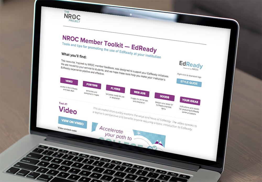
In 2015 we produced a six-part online toolkit for education leaders to promote EdReady within their own institutions. A variety of customizable materials and a complete style guide were included.

The toolkit was also shared as a credit-card-sized flash drive in conference bags. Our work has included designs for conference signage, name tags, and collateral.
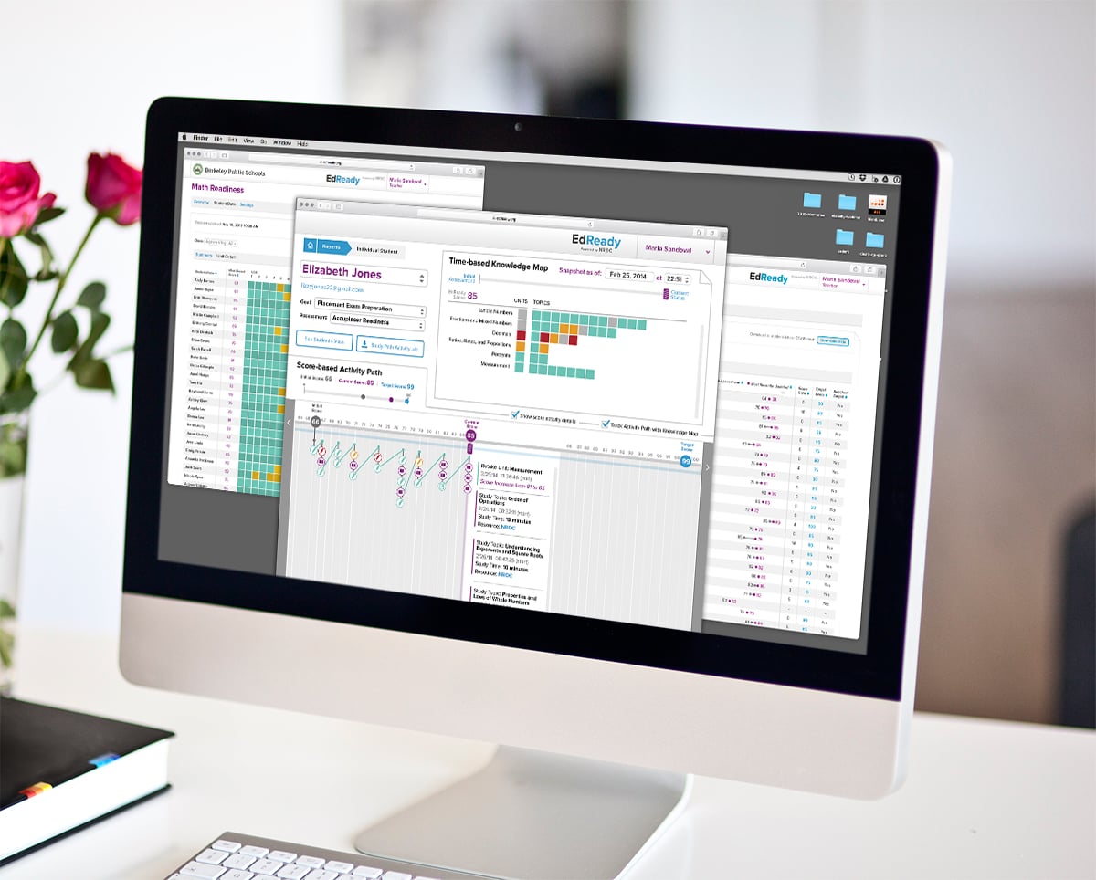
A suite of reports allows administrators and teachers to support students using EdReady. How is Ms. Sandoval's Algebra 1 class performing? How has Elizabeth been spending her time inside EdReady? How did Jonathan reach his target score so quickly? Blue Marble helped NROC to create a system that answers questions like these based on research into the needs of EdReady's administrative users.
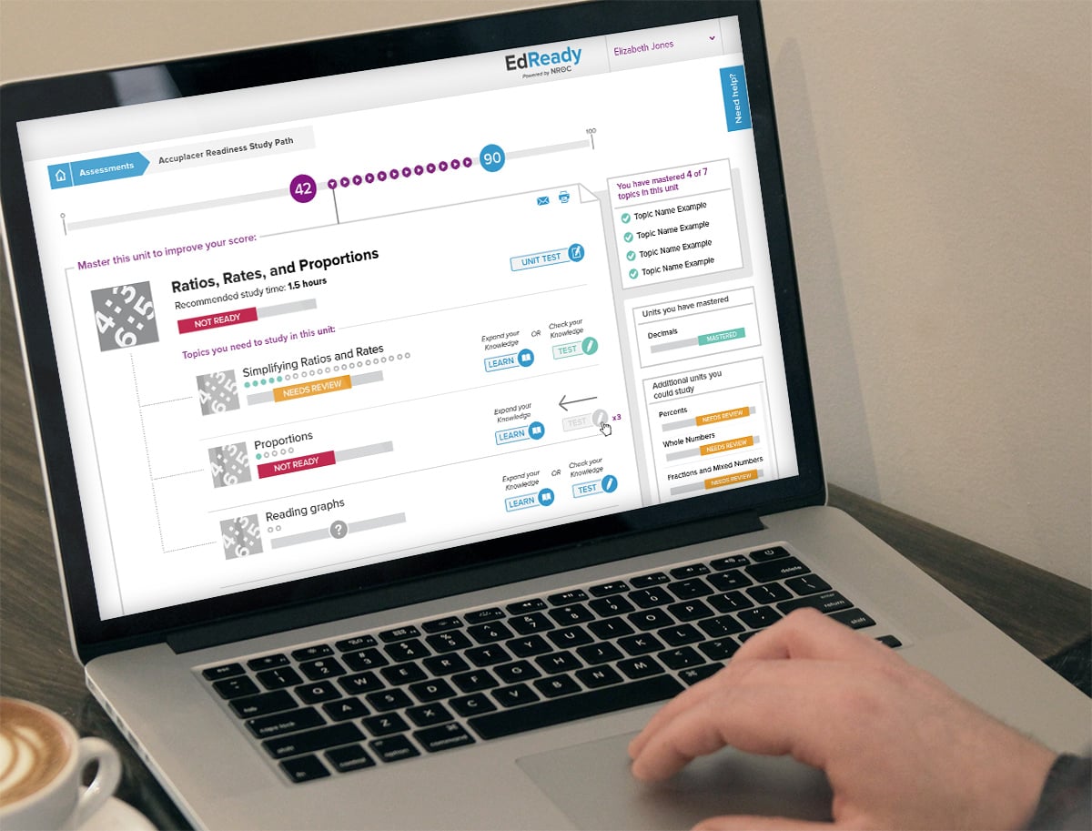
The "study path" where a student can learn about topics they need to study, then check their knowledge to improve their scores. Students can learn and assess themselves at their own pace in a low-stakes environment with constant feedback.
The NROC Project
Interaction/interface design
Customer/user experience
Brand and message development
Multimedia campaigns
Print and digital publication
Illustration, photography, video production, motion graphics
“I think of Blue Marble as part of our team. Without their vision and creativity we would not have a fraction of the success we have enjoyed. Blue Marble took the time to understand the students and instructors that we serve, as well as the challenges we face. They committed creatively and emotionally to both our business success and our mission success.”
– Gary Lopez, Ph.D, Founder and CEO, The NROC Project
“We’ve got many students falling out of higher education. The work NROC is doing in technology and education could not be more important.”
– Martha Kanter, Former U.S. Department of Education Undersecretary
Hundreds of education leaders have contributed time and expertise to this project and the underlying learning resources. It is truly a labor of love for many.
To learn more about the organization behind EdReady, and to hear what education leaders are saying about EdReady, see the above video. You can also learn more about our work on The NROC Project.
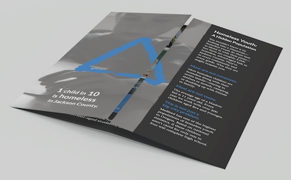
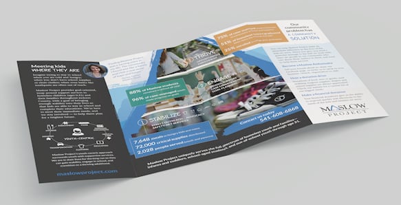
Maslow Project has worked hard to establish a network of programs and support to address the physical, mental, emotional and aspirational needs of Jackson County’s homeless youth and their families. When they contacted Blue Marble, Maslow already had tremendous impact in the community and was highly regarded as an agency of integrity in advocating for its clients. Although Maslow Project had already gained some national (and even international) attention for its innovative model, they struggled to allocate the necessary resources to build and maintain a cohesive brand identity. Unfortunately, this led to confusion with other human services organizations in the community. When a donor asked where Maslow needed the most support, the leadership spoke up about the need for help with branding. The donor suggested (and generously funded) Blue Marble to develop a communication strategy to take Maslow's communications to the next level.
We took a two-pronged approach, developing one communication piece aimed at homeless youth and families, and another aimed at donors. The two audiences are both critically important, and in the process of developing these different items we gained a lot of clarity about the different needs and perspectives of each.
Maslow’s clients are young people, so protecting their privacy and respecting their dignity is paramount. As such Maslow had long ago decided against using images of their clients’ faces or other identifying features in any marketing or outreach material. We wholeheartedly agreed and took this into account when considering concepts for imagery. We all agreed that Maslow’s successful art therapy program would be a wonderful resource for inspiration.
The blue triangle in the Maslow logo is a powerful symbol that we retained and emphasized. The meaning of the triangle conveys many things besides the literal reference to Abraham Maslow’s hierarchy of needs. We were reminded of the gable of a roof, a tent, raising up, strength, and stability. Inspired by a client artwork that depicted hands together in the shape of a triangle, we recommended that the Maslow team start using this hand gesture in real life as a physical symbol denoting “Maslow." When the hands are together formed into the triangle, they also convey the idea of embracing, encircling—Maslow’s wrap-around support.
It was also important to keep in mind that homelessness often goes unnoticed because it's not what people may assume. We were careful not to use any imagery that depicted dirty, downtrodden persons hanging on street corners or in back alleys. By contrast, we show uplifting images based on what Maslow offers its clients and their families and portray the outcomes that Maslow kids experience.
Now Maslow has a consistent, tangible way to describe how it works and to reference the many services it encompasses. External communications are better aligned with the organization’s internal vision.
Maslow is able to differentiate from other organizations and establish its unique value proposition.
Staff report a greater confidence and clarity when talking to others about what Maslow does.
The team now has key collateral pieces like brochures and an array of visual assets, and they have been able to use to create other material in-house.


Photography credit: Natalie Faye (hands images and many others used on brochures)
Maslow Project
Communication strategy
Brand and message development
Print and digital publication
“It’s been capacity building for us in terms of now we not only have the assets, but we have the different pieces. We have our message much more finely targeted, and that did exactly what I was hoping which was to enable us to be more effective in telling our story out in the community and get community engagement.”
– Karen Phillips, Development Manager
“We are very happy with the products that we have. We have used them and people are responding very favorably. Our donors who funded the project are extremely pleased with the end result.”
– Mary Ferrell, Executive Director
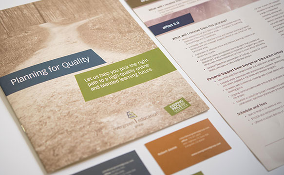
Keeping Pace with K-12 Digital Learning is an annual report that examines the status of K-12 online education across the United States. Schools, districts, nonprofits, government, and companies rely on the Keeping Pace annual report and website to pinpoint key challenges and see overarching trends. With so much information to convey, Evergreen Education Group has worked with Blue Marble over the past seven years to enhance the visual presentation of this annual report. Every year we make incremental improvements to make this important body of research more accessible to diverse audiences.
Knowing that the visual presentation of the data in the Keeping Pace report is nearly as important as the data itself, Blue Marble has taken part in numerous discussions with Keeping Pace authors. We introduced new design concepts for maps, charts, and tables to make the information easier to digest and share — in print and digital formats. Developing these visual tools requires a high level of collaboration between Blue Marble and the report’s authors and stakeholders. In addition, with so many rapid changes happening in the field of online and blended learning, the Keeping Pace printed report quickly becomes dated. A website with a customized content management system and integrated blog allows Evergreen staff to easily disseminate their research, keep information up to date, and share their expertise throughout the year.
Making information fresh and accessible
Evergreen Education Group has redefined the way information is conveyed in K-12 online and blended learning.
Infographics are now an anchor of the Keeping Pace annual report and website, and are used in presentations, classes and more.
Interactive maps on the Keeping Pace website feature up-to-date information.
Reports and infographics are available for free download and easy sharing.
A fully integrated blog has given Evergreen staff a platform on which to build their thought leadership, expand their reach and allow experts to share relevant news and resources on an ongoing basis.
For many years, we've worked with the Keeping Pace research team to distill the key findings and transform them into compelling stories. Whether the stories are told through graphics, case studies, or other narrative styles, Blue Marble helps ensure that Keeping Pace delivers rich, compelling content that’s freely available in both print and digital channels.
In 2015 the authors of Keeping Pace decided to shift the focus completely from text to data visualization. We created a significantly greater number of infographics and adjusted the layout to bring in more white space. The result is a visually compelling presentation of data-rich information throughout the whole of the 2015 report; a change that has been positively received by audiences.


Evergreen Education Group
Website design and development
Print and digital publication
“Blue Marble has become an indispensable part of our team, providing strategic creative thinking, graphic design and website development. They have given us a professional, creative look and their work is consistently complimented by our clients.”
– John Watson, founder of Evergreen Education Group
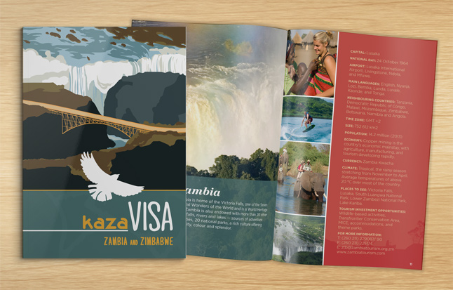
With the goal of increasing trade in tourism services and easing the movement of travelers across their borders, partner countries of the Kavango Zambezi Transfrontier Conservation Area (KAZA) were in the process of transitioning their individual visa programs into a single unified visa system called KAZA VISA. This was to be the prototype for a wider unified visa program among the partner countries of the Southern African Development Community. As part of an awareness campaign that was launching at the United Nations World Tourism Organization 2013 Assembly, The World Bank hired Blue Marble to develop a brand identity and communication materials that would garner support and leverage growing enthusiasm for the KAZA VISA program.
The primary draw for most of the KAZA partner countries is their abundant and unique flora and fauna. As such we focused on how to use wildlife as a central theme and also convey the idea of borderless travel. We settled on a white bird in flight as the graphic for the primary logo. In certain formats, this logo was expanded to include an illustrated depiction of the Victoria Falls Bridge connecting Zambia and Zimbabwe which, with Zambia and Zimbabwe as the two pilot countries for the KAZA VISA, was symbolic of their close partnership.
We created a small booklet to provide detailed information about the KAZA VISA program as well as profile the KAZA partner countries. As KAZA VISA is ultimately a promotion for travel within and among the KAZA partner countries, we formatted the booklet to have a similar feel as a passport. It was important to incorporate beautiful imagery of landscape and wildlife and although the KAZA team lacked access to high quality photos, we were able to secure many compelling images from our own image library. We also designed business stationery, a rack card and large stand-up banner for The World Bank and KAZA teams for use at various events and for branded correspondence with current and prospective program participants and backers.
Bringing the KAZA VISA concept to life
The brand identity enabled The World Bank and KAZA teams to more successfully educate and generate support for the program. The communication materials have helped to encourage regional collaboration between KAZA partner countries and in particular to build awareness of Zimbabwe and Zambia as competitive international tourism destinations for cross-border tourism activities.


The World Bank
Brand and message development
Print and digital publication

When Dave Martin, owner and practitioner at Trinity Natural Medicine (TNM) and the White Salmon Apothecary (WSA), was first getting established, he recognized he needed help with several key aspects of launching a new business. In addition to seeing patients in his Chinese medicine practice, Martin was planning to carry and sell a wide selection of Chinese herbs to fill custom prescriptions for his clients and other practioners. Martin originally went to Blue Marble because he wanted help in producing his basic vision for a logo. What he didn't realize was how much BMC would be able to help him via our BluePrinting process to clarify and document many aspects of how his business would work.
Martin received guidance and input as he refined his business strategy.
A responsive website with well-structured content allowed the client to establish credibility and trust with the community.
Being in the clinic is a sensory experience. A library of high quality image assets helps to show future patients and customers how it is to be treated in this environment, surrounded by rare Chinese herbs and Martin’s fine carpentry work.
Martin’s mother happens to be a professional illustrator. Her illustrations are used in the logo for the apothecary.
Branded client in-take forms, labels, and packaging for the herbal prescriptions from the apothecary ensure a complete and pleasant customer experience. This level of attention to detail is further demonstration of how TNM treats its clients.

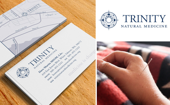

Photos by: Amarett Illustration by: Laura Martin
Trinity Natural Medicine
Brand and message development
Website design and development
Print and digital publication
Training and ongoing support
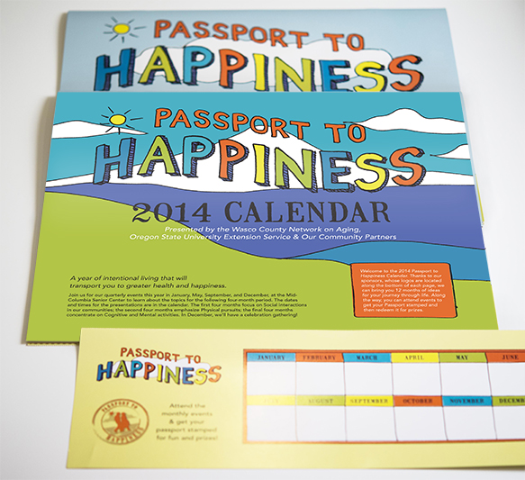
Backed by Oregon State University (OSU) Extension Service, the Wasco County Network on Aging is a consortium of local agencies focused on exploring ways to improve the health and well being of older adults living in Wasco County, Oregon. The organization offers monthly educational events for seniors who want to learn ways to improve their health and happiness. With a desire to increase participation in these events, OSU approached Blue Marble for assistance.
Blue Marble worked with OSU and Network staff to develop a campaign name, “Passport to Happiness,” and a brand identity that is light-hearted and energetic in tone. A key deliverable was a wall calendar that features healthy food recipes, tips on personal well-being, agency resources and a full schedule of events. We created large, custom illustrations and typography that would appeal to seniors and we incorporated professionally shot images of local residents involved in relevant activities. To encourage attendance at specific campaign-related events, we designed a passport card that participants could bring to events, have stamped, and then turn in for the chance to win prizes.
Increased participation among key audience
With a successful first year underway, the Network decided to continue the Passport to Happiness campaign and hired Blue Marble to create a new calendar for the second year of the campaign. While the new calendar featured fresh photography and content, we maintained its overall visual identity order to build upon the project’s growing visibility and strengthen brand awareness.
Oregon State University
Brand and message development
Print and digital publication
“I am thrilled with the response we received for the calendars. Our program kick-off was a big success. I think the folks that participate in these educational events over the next year will really enjoy themselves and have an opportunity to reflect on their happiness and improve their health.”
– Lauren Kraemer, Oregon State University Extension Service, Wasco County


The last time stakeholders in the development and maintenance of the Florida National Scenic Trail sat together to discuss goals was 1986 when collaborators created the original Comprehensive Plan. Priorities and personalities shifted in the ensuing years until it became clear it was necessary to bring together land holders, trail managers and local conservation groups in order establish new priorities and create a strategy for the near-term evolution of the Trail. Conservation Impact facilitated the convening of stakeholders and managed the creation of a new 5-year strategic plan for the Florida National Scenic Trail.
The strategic plan is a landmark document that provides a framework for focused, collaborative efforts and allocates resources to achieve specific results that benefit both the trail and trail user. The plan also presents a new partnership model that fully engages a diverse group of land managers who are connected to the trail. In order to bring the concepts presented to life and ensure the information would be read, the project team hired Blue Marble to come up with a thoughtful design for its layout.
To appeal to a wide variety of constituents, the strategic plan needed to look less like a government white paper and more like a feature in an issue of National Geographic. To that end, we emphasized beautiful photography and lots of white space to evoke the ambience of the trail as it traverses the Florida coast and inland the expanse of its open spaces. We also incorporated a variety of staff and trail-user photos which gives readers a sense of personal connection and ownership. The publication's landscape orientation connects with the impressive length of the trail but more importantly maximizes optimal readability on screen.
As a printed brochure, the Florida National Scenic Trail Strategic Plan makes the work that has been done tangible for stakeholders. Digital versions of the plan have been widely distributed making it easy to share pertinent information among the partner entities and keep the public engaged. Elements of the brochure have since been used as visual references when providing progress updates.


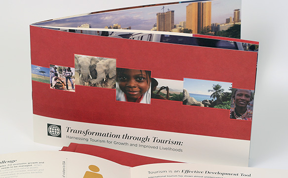
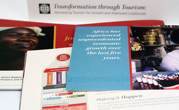
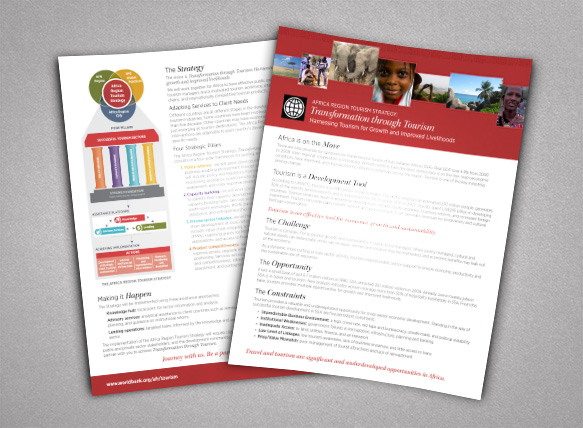
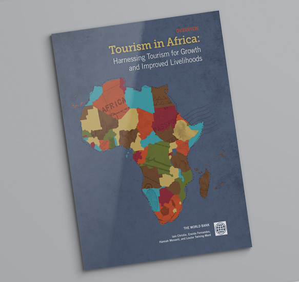
After two years of intensive research and data compilation, the World Bank’s Africa Region Finance and Private Sector Development Unit had devised a strategy for tourism development in Sub-Sahara Africa in an effort to: formalize its involvement in tourism in Africa, create a framework for future interventions, and prioritize tourism-related activities. To garner support and funding from the World Bank’s key internal and external stakeholders, the research team needed to succinctly explain their findings and recommendations in a format easily accessible to The World Bank’s Africa-based staff and partners.
Through a series of work sessions with the research team, Blue Marble helped to identify the project’s key messages and explored various ways to present them. After several iterations of data visualizations and story sequencing, we developed a shared understanding of the story and how best to tell it. A strong visual identity for the project and a series of graphics to represent core findings were critical components for building awareness of the work and explaining complex ideas that might otherwise be lost in cultural translation.
Confidently building stakeholder engagement
For the last several years, the Africa Tourism Strategy team has continued to promote its work and publish updated recommendations and findings as the project evolves. As part of a promotional campaign for AFTFP Tourism's recently released book entitled "Tourism in Africa: Harnessing Tourism for Growth and Improved Livelihoods," we created an informational booklet and one-pager which was shared at the United Nations World Tourism Organization's 2013 General Assembly.


The World Bank
Multimedia campaigns
Print and digital publication
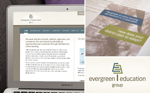
Founded in 2000 as Evergreen Consulting Associates, Evergreen Education Group underwent a major change in 2009 when the founder decided to transition away from environmental consulting and focus exclusively on the education technology (edtech) sector. This shift required a new company name, a new brand identity, and new communication tools such as a website and business stationery. As long-time partners, the company reached out to Blue Marble for help.
Our approach to Evergreen’s rebrand centered around market research and personal interviews with the company’s staff and key clients so we could understand current perceptions and the distance between those and the ultimate vision for the business. Through this research, we discovered that Evergreen should capitalize its ability to maintain neutrality in its work (impartiality is highly valued when working with private, governmental and nonprofit entities in education) and create a timeless image that would resonate with an ever-evolving audience. We helped Evergreen see the value of keeping its current name whose meaning was multifaceted, and evolved the wording slightly to allow for growth and clarification of their specialization.
Elevating Evergreen Education Group as an edtech leader
Since its rebrand, Evergreen has grown into a mid-sized company that utilizes a carefully crafted network of consultants and partners to fulfill its mission. The company is reputed as a leading edtech research and consulting firm. As the company’s service offerings have evolved, Blue Marble has helped Evergreen define and explain its value proposition to potential clients — through brochures, presentations, and other marketing materials.
Evergreen Education Group
Brand and message development
Website design and development
Print and digital publication
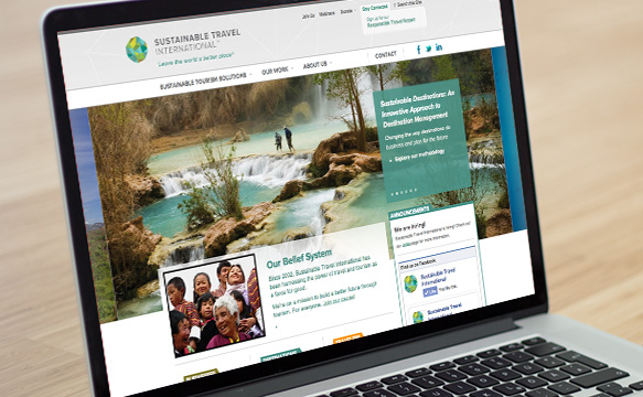
Sustainable Travel International (STI) offers innovative programs that support sustainable development through responsible travel. Founded in 2002, STI has evolved significantly.
At the time when STI hired us for a complete brand refresh and new website, the organization had been in operation for almost 10 years. Our work included:
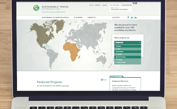
The new website features a searchable project map, a customized interface for managing staff, client, and project profiles and the ability for NGO subsidiaries of STI to create their own country-specific sections.
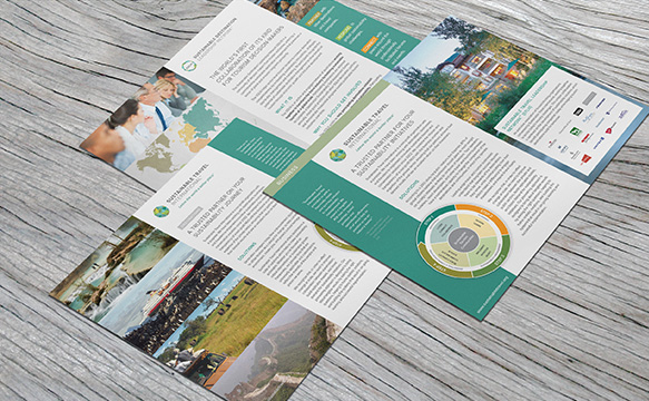
New business stationery, one-sheets, branded templates for client use, and an online style guide and digital brand assets provide the organization with a range of professional collateral and a sustainable system with which to share them.


Sustainable Travel International
Brand and message development
Website design and development
Print and digital publication
“The decision to work with Blue Marble Creative to develop our new brand and website paid off in numerous ways. Working with the entire team is a pleasure. They are intelligent, creative, supportive and bold, while acting as true partners in the creative process. ”
– Jeremy Sampson, VP of Marketing & Communications
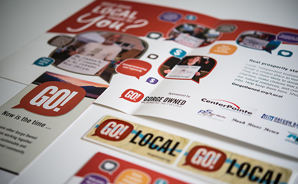
The Columbia River Gorge is comprised of many small towns scattered along the banks and mountain valleys of the Columbia River in both Oregon and Washington. When the founder approached Blue Marble about joining the steering committee and later board of directors, we were excited to help this fledging nonprofit become an anchor for economic and community development in our region.
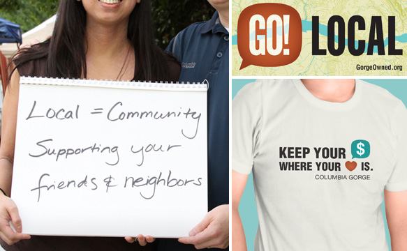
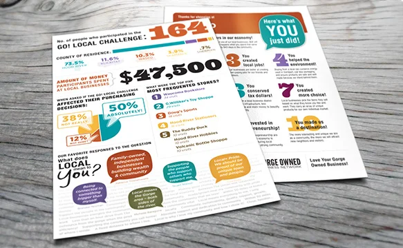
GO! established the region’s first “buy local” campaign. We developed a variety of “GO! Local” materials such as posters, T-shirts, stickers, business enrollment packets, a webpage (average 200 participants/year).
GO! had an extensive membership base and a positive impact on the community. While this org is no longer in existence, it was a catalyst to other successful projects and initiatives that continue to influence and contribute in the gorge today.

Gorge Owned Business Network
Brand and message development
Multimedia campaigns
Print and digital publication
“Blue Marble’s experience was a huge asset to GO! as the organization was establishing its value proposition. You have a passion and true talent for helping organizations tell the ‘why’ behind their story. Your diverse skill set — being able to leverage our brand into professional, polished marketing materials in different media — was invaluable.”
– Becky Brun, Marketing and Membership Director, Gorge Owned